Photo: Jonah Rosenberg/The New York Times
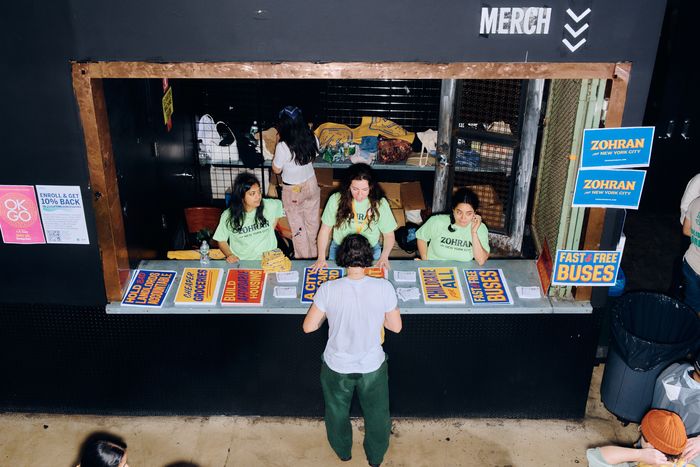
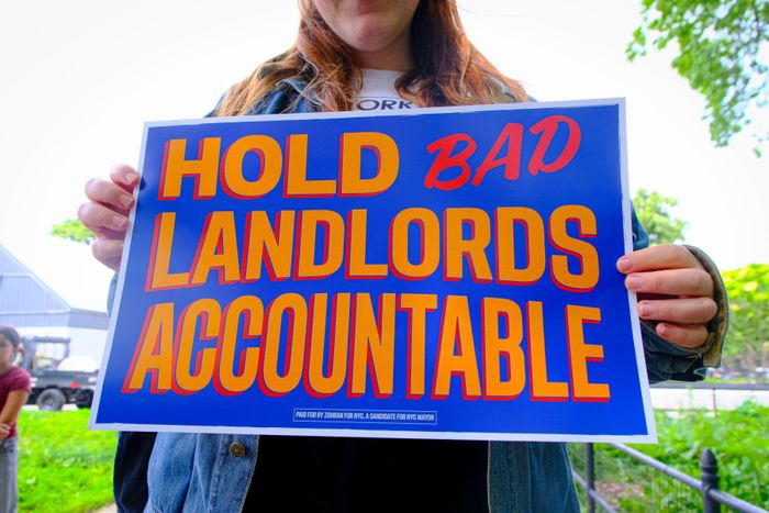
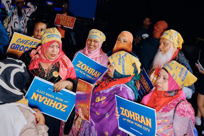
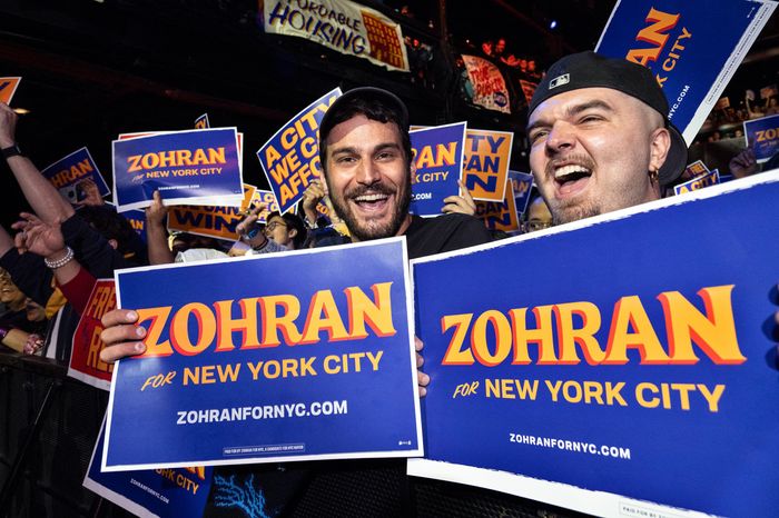
Nobody would credit Zohran Mamdani’s campaign graphics for his win, but they were, like his campaign, like nothing else in politics. First, there’s the saturated color palette: A royal-blue field—brighter and more electric than Biden blue—backs up ochre-yellow letters with vermilion drop shadows. (Occasionally the colors are reversed, with the ochre as the background.) The typeface has curvilinear flourishes and flares that suggest the hand-painted lettering on a storefront sign far from politics, like the 1-Shot lettering enamel on a Washington Heights awning reading COLD BEER. Other campaign materials are equally as memorable, especially the insouciant HOT GIRLS FOR ZOHRAN T-shirt. I cannot for the life of me tell you what Cuomo’s logotype looks like, and heaven knows you never saw a HOT GIRLS FOR CUOMO shirt anywhere.
What a Zohran graphic doesn’t look like, particularly, is a standard campaign logo. Most political logos are red-white-and-blue, and the blue is usually in a narrow range from Pantone 286 (beloved of hospitals and banks) down to Brooks Brothers navy. A long-odds candidate, like Amy Klobuchar in 2020, will now and then toss an extra color into the mix, perhaps out of a desire to stand out. (If a candidate happens to have a literally colorful name, that also opens up a new tonal avenue, as with the Texas congressman Al Green’s green.) Once in awhile a campaign tweaks the red and blue tones a bit, as Kamala Harris’s very good graphics did, but they’re still red and blue.
Some of those visual identities are sophisticated, the breakthrough being Barack Obama’s 2008 campaign materials incorporating the Gotham typeface, clean and modern and conveying a literal path forward through the big O. Before that, Al Gore’s orbiting star implied a worldview that reached for the heavens and considered the atmosphere while doing it. Gore reportedly workshopped all the sketches himself for his 2000 logo, which went up against a blocky, charm-free Bush-Cheney logo. (You know how that ended.) More recently, the field was revolutionized by the graphics deployed by Alexandra Ocasio-Cortez’s campaign, whose upward-slanting type, coming out of the design firm Tandem, gestured to the tradition of revolutionary poster graphics. Everyone on the left, for a while thereafter, seemed to be tilting their heads in homage. The red MAGA hat, its grotesque message and shoddy typography notwithstanding, is also one of the branding triumphs of this generation.
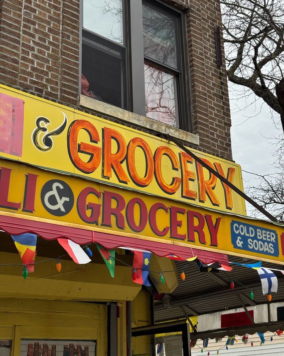
The Mamdani campaign’s identity is the work of a tiny design co-op called Forge, and specifically its designer Aneesh Bhoopathy, formerly of Queens and now living in Philadelphia. Bhoopathy says that “the mood board was definitely New York iconography: taxicab yellow, MetroCard primary colors, bodega awnings, stuff people are familiar with in the New York street.” That tracks, though the yellow of the logo is a little more mustardy than the TLC standard. A Mamdani campaign manager has also mentioned Bollywood posters as another influence, which tracks, visually speaking; Bhoopathy says the candidate’s South Asian roots may have figured in that. But as soon as he said “bodega awnings,” that confirmed what I had guessed: Mamdani’s logo strongly evokes the hand-painted signage of the old-school New York corner grocery. My colleague Tom Alberty, New York’s design director, made the same observation as soon as I asked him about it. Vermilion and yellow, especially, are the bodega standard, although those hand-rendered beauties are gradually and sadly giving way to printed vinyl awnings.
Classic bodega lettering (here, in Ridgewood).
Photo: Jesse Reed
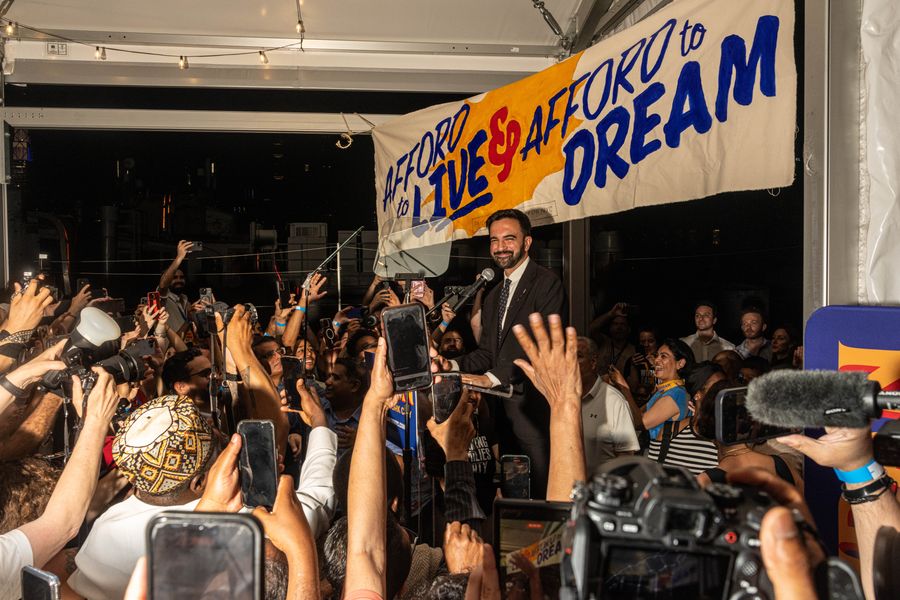
I called up Jesse Reed, principal of the design studio Order, to ask him what he saw in these logos, and he grasped what I was saying before I finished the question: “Bodega sign painting. The R in particular, and the supporting elements, like the script “for”—just classic bodega signage, and it’s brilliant. Grocery stores, too: I saw some photos of his rallies the other day, and the signs from the balcony literally looked like they could say BANANAS $2.99.”
Reed used to work at Pentagram, and was on the team that designed Hillary Clinton’s forward-arrow logo in 2016. People argued about that one—mostly because people argued about everything related to Hillary—but everyone can agree that it was a much more traditional logo than Mamdani’s, much more like a Fortune 500 logo than a local shop’s. “You know,” Reed says, “in my personal experience designing for political campaigns, there’s a way to do it that revolves around a symbol, a corporate-identity approach. That clearly doesn’t work in this space”—that is, for Mamdani’s anti-corporate campaign—”and they took the opposite approach, coming from the human hand, a diverse visual language that comes out of the communication of typography that isn’t the same as a Chase bank.”
Grocery-store-style signage.
Photo: Alex Kent
And in fact, Bhoopathy says that Zohran’s name is indeed hand-drawn, although the letterforms evolved from those of a typeface called Boheld. A lot of the other material across the campaign is set in Union Gothic, a sturdy and versatile sans serif with a little more muscle than your standard Helvetica. As for the blue, he says, “It’s in the candidate questionnaire I give people: Do you want to go Democrat blue or DSA red, which in some places reads as Republican?” With the design for Mamdani, however, the jumping-off point was neither. ”We started with the yellow as a first principle, and then found that we could use those three colors to do everything.” Why does the blue seem different from other campaigns’ blues? “We played with a lot of different colors and maximized the contrast off the yellow. It’s just a bit towards violet—maybe there’s something there, but I’m not quite sure.”
The particular yellow he used, says designer Aneesh Bhoopathy, was influenced by taxicabs, MetroCards, and (perhaps most of all) bodega signage.
Photo: Katie Godowski/Media Punch/Alamy
“Hell, yeah, it’s great,” agrees Scott Starrett, founder and director of Tandem, the firm that produced AOC’s influential graphics. “I instantly liked it—it’s leading in the direction I’ve always felt politics should be leading, more personal, more authentic.” He agrees that a more traditional identity might not have done anything for Mamdani: “It can be awkward to mix commercial marketing and branding language with a person, and his communication was extremely effective—everyone saw it and got a sense of a unique character right away. There was charisma in the posters and logos.” They were also, he points out, particular to Mamdani’s persona. “You could apply this branding to someone else who can’t wear it well.”
The ZOHRAN lettering is hand-drawn, with origins in a typeface called Boheld.
Photo: Jonah Rosenberg
The smaller NEW YORK CITY type is in a muscular sans serif face called Union Gothic.
Photo: Laura Brett/ZUMA/Alamy
I ask Starrett about the AOC logo his firm designed, and how he sees it relating to Mamdani’s. “That’s where we started—if we have to put those posters in Queens and the Bronx, they can’t be too slick, too complicated, and they have to be able to hold their own.” Reed, too, sees their designs on a continuum: “You could argue that her typography was originally influenced by hand-painted signs, too, but it was digitized to the point where it looked more streamlined. Whereas Mamdani leaned into the hand-painted-from-a-person direction, and it softens and warms it up.” Those differentiated approaches may have usefully played against stereotypes: a young woman who was a total outsider perhaps needed to emphasize her crisper and more businesslike aspects, whereas a guy with famous parents could benefit from deemphasizing polish. Starrett also mentions the design work his shop did for the city-council candidate Shekar Krishnan, with typography that ever so slightly gestured towards South Asian letterforms. “We certainly were intentionally trying to signal heritage in the custom type, and I think a similar thing was going on with Zohran.”
“Also?” Starrett muses. “It’s Knicks-Mets colors.” (More or less true, which is to say that they approximate New York City’s official colors.) “And both teams don’t always do well, and they both are right now.”


